
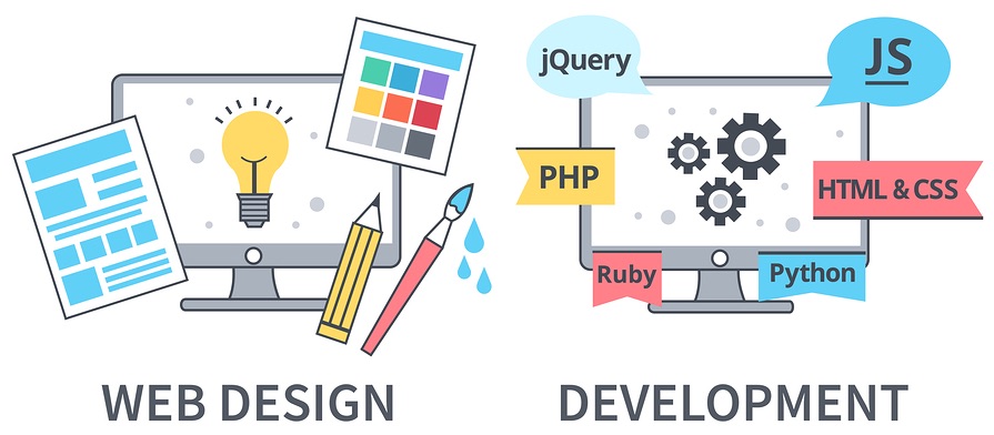
Web Design and Web Development: Creating Better Digital Experiences
A successful website is more than an attractive collection of pages. It needs to be easy to use, work reliably and help visitors find what they need. Web design and web development work together to make that possible: design shapes the experience, while development builds the technology behind it.
What is web design?
Web design focuses on how a website looks and feels, and how people move through it. It includes layout, colours, typography, imagery and the organisation of content. Good design makes information clear and helps visitors complete tasks, whether they are looking for details, making an enquiry or buying a product.
Designers also consider the needs of different users and devices. A page should be easy to read on a mobile phone as well as on a larger screen. Clear navigation, readable text and thoughtfully placed buttons can make the difference between a frustrating visit and a useful one.
What is web development?
Web development is the process of building and maintaining a website. It may involve creating the visible parts of a site, connecting forms and other features, and developing the systems that run behind the scenes.
Front-end development brings the design to life in a browser. Back-end development supports features such as databases, user accounts and content management. Some projects also use third-party services, such as payment providers or booking tools.
How design and development work together
Design and development are closely connected. A design needs to be practical to build, while development decisions can affect how a website looks and behaves. When designers and developers work together from the start, they can identify issues early and create a more consistent experience.
The process often begins with understanding the website’s purpose and audience. From there, a team may plan the site structure, prepare page layouts, create visual designs, build the website and test it before launch. Feedback and improvements can continue after the site is live.
What makes a good website?
- Responsive design: Pages should adapt to different screen sizes and devices.
- Accessible content: Clear structure, readable text, keyboard-friendly controls and suitable image descriptions help more people use a site.
- Useful navigation: Visitors should be able to understand where they are and find important information without unnecessary effort.
- Strong performance: Efficient code and optimised images can help pages load promptly.
- Relevant content: Accurate, well-organised information gives visitors a reason to stay and take the next step.
- Ongoing care: Updates, backups and security checks help keep a website reliable over time.
Planning for search engines
Search engine optimisation is easier to consider when a website is being planned, rather than added as an afterthought. A logical page structure, descriptive headings, useful page titles and fast-loading content can help search engines understand a site. The priority should still be creating clear, valuable information for people.
A website is an ongoing project
Launching a website is an important milestone, but it is not necessarily the end of the work. Visitor needs, technology and business goals can change. Reviewing how people use the site and keeping its content and software up to date can help it remain useful and secure.
When web design and development are guided by a clear purpose, the result can be more than visually appealing. It can be an accessible, dependable and effective place for people to learn, connect and take action.
7 Essential Tips for Effective Web Design and Development
- Keep layouts clear and uncluttered.
- Design for mobile screens first.
- Use accessible colours and readable text.
- Make navigation simple and consistent.
- Optimise images to speed up pages.
- Test across browsers and devices.
- Write semantic, maintainable code.
Keep layouts clear and uncluttered.
Keep layouts clear and uncluttered to help visitors find information quickly and use your website with ease. Give content room to breathe, use headings to create a clear structure, and limit distractions such as unnecessary graphics or competing calls to action. A simple, well-organised design can improve readability on both desktop and mobile, while making the site easier to navigate and maintain.
Design for mobile screens first.
Designing for mobile screens first helps ensure your website works well where many people are most likely to use it: on a phone. Start with the essentials, such as clear content, simple navigation and easy-to-tap buttons, then adapt the layout for larger screens. This approach encourages a focused, uncluttered design and helps developers build responsive pages that remain easy to use across different devices.
Use accessible colours and readable text.
Use colours with enough contrast to make text easy to read, and avoid relying on colour alone to communicate important information. Choose clear, legible fonts and a comfortable text size, with spacing that helps readers follow each line. These choices make a website easier to use for more people, including visitors with visual impairments or those viewing it on a small screen.
Make navigation simple and consistent.
Keep your website’s navigation simple and consistent so visitors can find what they need without confusion. Use clear, familiar labels, organise related pages into logical sections and place the main menu where people expect to find it. Keeping the menu layout and naming consistent across pages helps users understand where they are and move around the site with confidence, whether they are browsing on a computer, tablet or mobile phone.
Optimise images to speed up pages.
Optimising images can make a noticeable difference to page speed, particularly for visitors using mobile data or slower connections. Resize images to the dimensions they’ll be displayed at, choose an efficient format such as WebP where supported, and compress files without sacrificing too much visual quality. Adding appropriately sized responsive versions can also prevent devices from downloading unnecessarily large images, helping pages load faster and feel smoother to use.
Test across browsers and devices.
Test your website across different browsers and devices to make sure it works well for everyone. A page that looks polished on one desktop browser may display differently on a mobile phone or another browser. Check layouts, navigation, forms, images and interactive features at a range of screen sizes, and fix any issues you find. Regular testing helps create a consistent, accessible experience for all visitors.
Write semantic, maintainable code.
Write semantic, maintainable code by choosing HTML elements for their intended purpose, using clear names and keeping styles and scripts well organised. Semantic markup helps browsers, search engines and assistive technologies understand a page, while consistent, readable code is easier to test, update and extend. These habits make websites more accessible and reduce the effort needed to fix issues or add features later.