
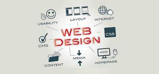
Web Design and Development: Creating Effective Digital Experiences
A website is often the first place people encounter a business, organisation or idea. A well-made site does more than look attractive: it helps visitors find information, complete tasks and understand what makes a brand distinctive. Achieving this takes a thoughtful combination of web design and development.
What is web design?
Web design focuses on how a website looks and feels, and how people use it. It includes the layout, colours, typography, images, navigation and interactive elements. Good design gives a site a clear visual identity while making its content easy to understand.
Designers consider the needs of different visitors, the purpose of each page and the actions people may want to take. A clear menu, readable text and consistent page layouts can make it easier for users to move through a site with confidence.
What is web development?
Web development turns a design into a working website. Developers use technologies such as HTML, CSS and JavaScript to build pages and interactive features. Depending on the project, they may also work with content management systems, databases, e-commerce platforms and other services.
Development also covers practical considerations such as loading speed, security, accessibility and compatibility with different browsers and devices. These foundations help a website work reliably, not just look good in a design mock-up.
Why design and development work best together
Design and development are closely connected. A design needs to account for what can be built, while development needs to preserve the purpose and usability of the design. When designers and developers collaborate from the start, potential issues can be spotted early and decisions can be made with the complete experience in mind.
This joined-up approach can also help keep a project focused. Rather than adding features simply because they are available, the team can prioritise the ones that serve users and support the organisation’s goals.
Key principles of an effective website
- Clarity: Use straightforward language and a clear structure so visitors can quickly understand what the site offers.
- Responsive design: Make sure pages adapt to mobile phones, tablets and desktop screens.
- Accessibility: Consider people with different needs by providing features such as keyboard navigation, descriptive link text and suitable colour contrast.
- Performance: Optimise images and code to help pages load promptly, including on slower connections.
- Consistency: Use a coherent visual style and predictable navigation throughout the site.
- Security: Keep software up to date and protect visitors’ information with appropriate security measures.
The web design and development process
Every project is different, but a typical process begins with discovery and planning. This involves understanding the audience, defining the site’s goals and deciding what content and functionality are needed.
Next comes the design stage, where page structures and visual styles are developed. Once the design has been agreed, developers build the site and connect any required tools or services. The finished website is then tested across devices and browsers, checked for usability and accessibility, and refined before launch.
Launching a website is not necessarily the end of the work. Regular updates, monitoring and improvements help keep it secure, useful and aligned with changing needs. Reviewing visitor feedback and site performance can reveal where further changes would make the experience better.
Building for the long term
Successful web design and development balance appearance, usability and technical quality. A thoughtful website gives people a straightforward way to engage with an organisation and provides a solid foundation for future growth. By focusing on real user needs and maintaining the site over time, businesses can create digital experiences that remain useful well beyond launch day.
8 Essential Tips for Better Web Design and Development
- Design for mobile screens first.
- Keep navigation clear and consistent.
- Use accessible colour contrast.
- Choose readable fonts and sizes.
- Optimise images to speed up pages.
- Write semantic, well-structured HTML.
- Test across browsers and devices.
- Make forms simple and accessible.
Design for mobile screens first.
Designing for mobile screens first encourages a clear, focused experience from the outset. With limited space, it’s important to prioritise the most useful content, make navigation simple and ensure buttons are easy to tap. Once the mobile layout works well, it can be expanded for tablets and larger screens, rather than trying to squeeze a desktop design onto a phone. This approach helps create a responsive website that is easier to use across devices.
Keep navigation clear and consistent.
Keep navigation clear and consistent so visitors can find what they need without having to guess. Use familiar labels, organise pages in a logical order and place menus where people expect to find them. Keeping the same navigation across the site helps users understand where they are and move between pages with confidence, whether they are browsing on a desktop or a mobile device.
Use accessible colour contrast.
Use accessible colour contrast to make text and important interface elements easier for everyone to see and understand, including people with low vision or colour blindness. Choose foreground and background colours that are distinct, and don’t rely on colour alone to communicate meaning—for example, pair status colours with clear labels or icons. Check combinations with a contrast checker, and test them across different screens and lighting conditions.
Choose readable fonts and sizes.
Choose fonts that are clear and comfortable to read, and use a size that works well across different devices. Keep body text large enough to read without zooming, with suitable spacing between lines and paragraphs. Limit the number of typefaces and use consistent styles for headings, body copy and links. Good typography helps visitors scan your content, understand your message and enjoy a more accessible experience.
Optimise images to speed up pages.
Optimise images to help your pages load faster and provide a smoother experience, particularly for visitors using mobile devices or slower connections. Resize images to the dimensions they’ll be displayed at, choose an efficient format such as WebP where supported, and compress files without noticeably reducing quality. Adding descriptive alt text also makes images more accessible and helps explain their content when they cannot be seen.
Write semantic, well-structured HTML.
Write semantic, well-structured HTML to make your website easier to understand, maintain and navigate. Use elements such as <header>, <nav>, <main> and <footer> to give content a clear structure, and choose headings in a logical order. Semantic markup helps browsers and assistive technologies interpret your pages, supporting accessibility and making your content easier for search engines to understand.
Test across browsers and devices.
Test your website across a range of browsers and devices before launch. A page that looks polished on one desktop browser may display differently on a mobile phone, tablet or another browser. Check that layouts adapt smoothly, text remains readable, navigation works and interactive features behave as expected. Testing in real-world conditions helps uncover problems early and ensures more visitors enjoy a consistent, reliable experience.
Make forms simple and accessible.
Make forms simple and accessible by asking only for information you genuinely need and arranging questions in a clear, logical order. Use descriptive labels, helpful instructions and plain language, and make sure fields can be completed using a keyboard as well as a touchscreen or mouse. Clear error messages should explain what needs fixing, while good colour contrast and appropriately sized controls make forms easier for everyone to use. A straightforward form helps visitors complete their task with less effort.